
Creating cover photos for Facebook has never been so simple; Today we have more resources at our disposal than at any other time. Anyway, before I start giving you my pro tips for designing your social content, how much creativity did you put into your last cover photo?
If you’re like most small business owners, you probably haven’t invested that much creativity at all, which is a shame.
Your Facebook photo represents an extremely important piece of your Facebook page; However, many companies completely waste it.
Your cover photo should not only look good, but it should also serve a purpose and represent your brand appropriately. In this article, we will discuss several key tips for designing highly effective cover photos for your Facebook Page.
Let us begin.
How to create cover photos for Facebook
1. Select a goal for your cover photo
Believe it or not, a cover photo can be more than a simple logo on a background with boring colors.
While they can be great for branding purposes, cover photos can also help you achieve other business goals. This could be generating registrations or subscriptions for your products, announcing a sale, or promoting an upcoming webinar.
Check out the cover photo of Leadpages’ Drip marketing and automation tool.
As you can see, there is an obvious objective which is to increase registrations for their free training. They achieved this while keeping their brand intact and showing a glimpse of the product’s capabilities.
Image courtesy of Drip the Leadpages and Facebook.
Another excellent example is Bootea.
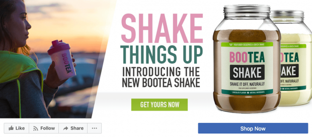
Image courtesy of Boot on Facebook.
As you can see, they don’t waste any resources here. On the contrary, they use their Facebook cover very cleverly to promote a completely new product. This is highly effective because there is a “Buy Now” call to action (CTA) directly below the cover image.
Drip and Bootea are two of the many companies that effectively use cover photos to achieve goals. The bottom line here is that you need to work harder to know what you want your Facebook cover to achieve.
2. When creating cover photos for Facebook, design with the network’s recommended measurements
There are three things that are certain in life: death, taxes, and Facebook changing its design.
Obviously, one of the things that takes a hit when Facebook changes its design is the cover photo itself. For this reason, you must stay ahead of every aspect and make sure you always use the right dimensions.
At the moment, the Facebook cover photo supports 820 x 312 pixels on desktop screens. On smartphones, it supports 640 x 360 pixels. Therefore, you may want to consider moving key pieces of your cover photo to the center so they don’t get cropped on mobile devices.
While Facebook states that your cover photo can be a minimum of 399 x 150 pixels, I personally don’t recommend using a resolution lower than what Facebook supports for your cover photo on desktop.

3. Brand consistency
We mentioned that a cover photo shouldn’t always be a company logo on a background, which is true. However, regardless of the goal you are trying to achieve, we recommend always having brand consistency through your cover photo. When creating cover photos for Facebook you should consider that using a social media style guide will be essential for your entire online presence.
Now, how do you maintain brand consistency when designing cover photos?
These are some aspects to consider.
Color range
Whenever possible, try to include your brand colors. As users continue to interact with your brand, you will infiltrate their subconscious, as long as you maintain consistency in your brand elements.
Blue is a primary color in our brand kit at Snappa, so it’s no surprise that we use it in our cover photo. When users visit our website, they encounter the exact same shade of blue.

Image courtesy of Snap a Facebook.
Fonts and typefaces
It is not mandatory that they necessarily use the same font on each of the cover photos. In fact, that would be a bit boring.
However, the font itself should represent your brand. For example, if you sell luxury watches, your fonts will most likely contain clean lines and allow for easy reading.
On the other hand, it makes sense that children’s playground like Cosmic Adventures would use eye-catching fonts like the ones in their cover photo below.

Image courtesy of Cosmic Adventures en Facebook.
Secondary elements
Almost all companies use brand colors and fonts. However, perhaps you should use secondary elements in all your marketing. These could include graphics, shapes, icons, or other design elements to complement your branding. So when creating cover photos for Facebook you won’t have to limit your design to a typography without further design elements.
Help Scout helpdesk software is a great example of a company using secondary elements to highlight its brand. When you see its cover photo, you notice the complex icon interwoven with labels.

Image courtesy of Help Scout en Facebook.
So when you take a look at their blog, you will notice that they use the same graphics and icons within the images they present.

Image courtesy of Help Scout.
Whenever I see one of these cleverly designed icons, I immediately think of Help Scout.
4. Make your profile photo and cover photo work together
Although we are dedicating the entire article to the design of an effective cover photo, we are not going to neglect talking a little about your profile photo. This is because your profile photo must combine very well with your cover photo. When creating cover photos for Facebook, consider that generating synergy between your profile photo and cover photo will increase the cohesion of your content and style. Therefore you will have more possibilities of acquiring new followers.
The best way to achieve this is by making sure your profile photo uses the same style guidelines as your cover photo. If your profile photo is mostly red, it would look pretty bad next to a cover photo that is mostly yellow.
Financial company TD Canada does a great job of making their profile photo and cover photo match very well. As usual, TD set its profile photo with its trademark logo on a green background. This gives it a fantastic look in contrast to its black and white cover photo with green design elements.
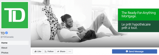
Image courtesy of TD Canada on Facebook.
Not only do the colors match, but all the green elements pop beautifully on the page.
5. Ensure adequate contrast
So far we’ve covered more about the fundamentals of cover photos. Let’s shift our focus to some design principles.
Before you get scared, and before creating cover photos for Facebook, I warn you that we are not going to analyze complex design theories. The truth is that even a beginner can succeed with a little basic design knowledge.
Now, what is one of the most important design concepts for a beginner to understand?
In my opinion, the contrast.
Using proper contrast will give your graphic impact and make it legible. Contrast is what makes Apple’s ads so impactful.
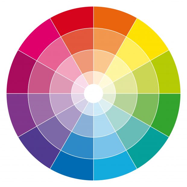
The main (and most common) way to achieve contrast is through colors. If you use a white background, you’ll probably want to use dark text. Likewise, if you use a dark background, you would probably want to use light text.

Now, what happens if you don’t just use black and white colors? This is where a color wheel comes in handy. In essence, the colors at opposite ends of the wheel will represent the perfect contrast. This is what you should focus on.
The next important element of contrast is size. Basically, you’ll want to use larger text sizes for titles, and smaller text sizes for content. This creates an obvious distinction between the two, which will allow your title to stand out.
Lastly, contrast positioning allows you to create a hierarchy of elements solely by using different alignments.
We see an excellent example of the integration of all this in the cover photo of the Golden State Warriors basketball team. The bright yellow contrasts perfectly with the dark blue, and they use a subtle size contrast in their text.

Image courtesy of Golden State Warriors en Facebook.
6. Use white space to your advantage
When creating cover photos for Facebook, consider that people who are not dedicated to design usually tend to overdesign. That is, they add too many colors, too many fonts and capture too many “things” in their cover photo.
One way to solve this is by using white space.
White space is virtually any part of your graphic that is “not used.” It helps separate text, objects, and other elements of your design.
Although there are many advantages to using white space, the biggest benefit is that it keeps your chart clean and helps the reader focus on the most important information.
Let’s look at this simplistic use of white space as an example.

Because there is so much white space (in fact, it’s all there is), the text immediately draws your attention.
Now, for a more relevant example, look at the cover photo of the cosmetics company Burt’s Bees’.

Image courtesy of Burt’s Bees en Facebook.
The amazing use of white space immediately takes you to the text that reads “Uncap Flavor” next to the image of their lip balm.
As you can see, there is a lot that needs to be taken into account when creating Facebook cover photos.
First, you need to determine the purpose of your cover photo and make sure you use the appropriate size. Subsequently, you need to ensure that your branding is consistent. Finally, you’ll want to use some key design principles like contrast and white space to ensure your cover photo really hits the spot.
Follow these key tips and you’ll be on the right path to creating highly effective cover photos for your Facebook Page.
Via: Hootsuite
Source: https://www.socialblabla.com/6-consejos-para-crear-las-mejores-fotos-de-portada-para-facebook.html